- User Experience
- Web Development
- Video
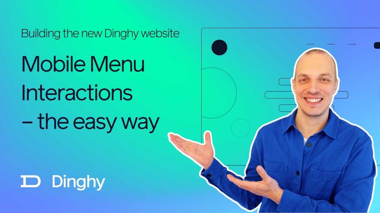
New Dinghy Website Part 9 – Mobile Menu Interactions

Video Summary
Hey everyone, Nils here from Dinghy Studio. Welcome back to our series. After a brief break, we’re diving back into the creation of our new agency’s website. Today's focus is on mobile optimizations – a crucial aspect often overlooked in the initial stages of web development.
I realized that the overlay menu for small screens needed a significant overhaul from the larger screens layout. So, let's take a look at what we came up with for the mobile version.
Using the Xcode simulator, I'm demonstrating our mobile site. You’ll notice the typical burger icon for the menu, which reveals the main navigation items in a staggered animation when clicked. The menu also includes a 'Get in Touch' button and a dedicated close button. A key feature here is preventing the page in the background from scrolling while the menu is open. This is essential for a more app-like feel.
Now, let's talk about the flicking gesture – something many of us are familiar with on mobile devices. I wanted to incorporate this intuitive action for closing the menu. Implementing this wasn’t as complicated as I initially thought, and no additional libraries were needed.
In Svelte, the framework we're using, we can attach event handlers for touch actions. For the flick gesture, we record the Y-coordinate and the time when the user touches the screen, and again when they lift their finger. This data helps us distinguish between a tap and a flick by calculating the speed and direction of the gesture.
Based on this, we can then animate the menu either up or down, or just let it fade out if the X button is pressed. The animation for the menu traveling is set to around 25% of the screen height, providing a smooth transition.
Another cool aspect is the staggered animation for the menu links. Each link has a slight delay in appearing, creating an engaging visual effect. This was achieved simply by multiplying the index number of each link with a 100 milliseconds delay.
I'm really pleased with how this turned out. It's a great example of how small, thoughtful interactions can make a website feel more dynamic and app-like. Plus, it's reassuring to see that such effects can be achieved with minimal code.
Stay tuned for the launch of our website in the next few days. I'm excited to finally share it with everyone and gather some feedback. Thanks for following along, and I’ll see you in the next video. Bye!