- Web Development
- CSS
- Video
New Dinghy site part 4 – subgrid in a carousel

Video Summary
Welcome back, everyone! Nils Borgböhmer here, continuing our series on the Dinghy website rebuild. Last time, we delved into structured content for our projects section. Today, I'm excited to showcase a completed project layout on our website.
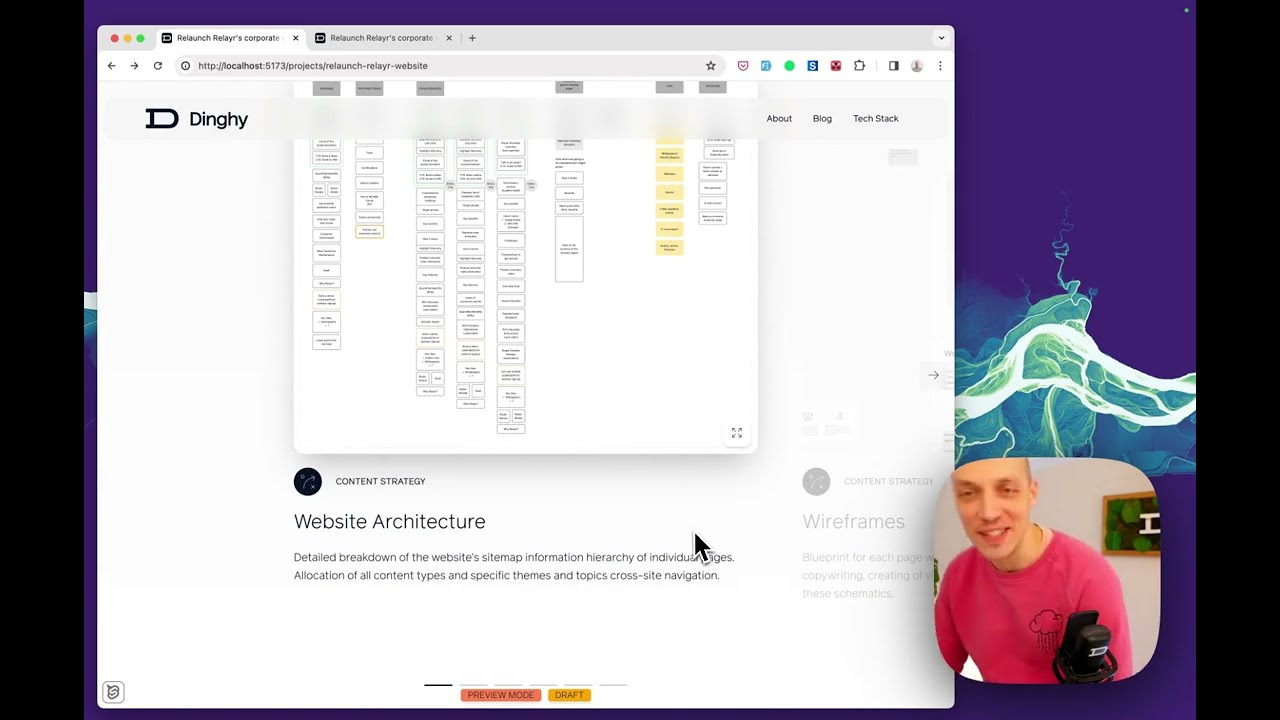
Let's dive into our studio. We've set up everything, including SEO fields, intro, company links, summary, cover image, project details, and more. We've also integrated tags and tools from our collections, ensuring seamless connections across the site.
A key feature I want to highlight today is the 'deliverables' section. We've designed it to clearly display the tangible outcomes provided to our clients, including images or videos. On the front end, this looks fantastic, with tags, tools, project outcomes, and the deliverable carousel all rendering beautifully.
The design challenge I faced was aligning images and videos of varying aspect ratios in the carousel. I wanted them to align at a central horizontal line, balancing text content and visuals. This proved tricky with traditional CSS, as elements would align at the top, leading to an uneven layout.
My initial approach was to set a fixed size for image containers. While this brought some alignment, it lacked flexibility and couldn't accommodate images of different shapes without breaking the layout.
Then, I remembered Tailwind CSS's recent update supporting subgrid, which turned out to be the perfect solution. Subgrid allows elements within a grid to align rows or columns with their parent grid, creating a more cohesive layout.
I applied subgrid to the carousel's container, defining four rows with the first three adapting to their content and the fourth taking up the remaining space. Each carousel item spans all four rows, allowing its content to align correctly within the shared grid.
The result is stunning. The tallest text section or image now defines the row height for all carousel items. This dynamic adjustment wasn't possible before subgrid in CSS, and it's a game changer for complex layouts.
I'm thrilled with how the design turned out. It's a testament to the power of new CSS features and our team's creativity. Thanks for tuning in, and I hope you're enjoying these insights into our web development process. Let me know your thoughts , and I'll see you in the next video. Bye!