- CSS
- Design & Feedback
- Web Development
- Video
New Dinghy Website part 8 – Circular Floating Images
Video Summary
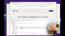
Hey everyone, Nils here from Dinghy Studio, back with another update on our agency's website rebuild. Today, I'm excited to discuss an animation we're implementing using a neat CSS feature.
On our homepage, we faced a unique layout challenge. Initially, I thought about absolutely positioning the elements, but then I decided to explore CSS's trigonometric functions. These functions, introduced last year, allow for circular layouts as opposed to the traditional rectangular ones.
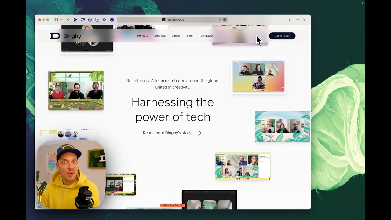
Let's take a quick look at how this is set up in our Sanity CMS. In the team section on the homepage, we have a straightforward setup – just a collection of images. The great thing about Sanity is that we can reorder these images easily without affecting the animation.
For mobile, we decided against the circular layout due to space constraints. Instead, we went for a photo stack effect where images slide over each other. It's a neat, space-efficient approach that maintains the visual appeal.
On desktop, however, we embraced the circular layout. Each image has a hover effect and is positioned in a circular formation. I added a bit of randomness to the positioning to avoid a perfect circle, giving it a more dynamic feel.
The core of this implementation is in the CSS. We use a loop in the code to create a list item with an image for each team member. A counter keeps track of the index number, which is crucial for positioning each image on the circle. By calculating the degrees like on a clock (based on the number of images), we can position each image precisely.
The exciting part is the use of CSS trigonometric functions for absolute positioning. These functions allow for an easier and more accurate placement on a circular path. This was a revelation to me, and I even used GPT to understand and implement these calculations.
To maintain the orientation of each image while rotating, we used the animation in two places: on the entire container and on each element, running it in reverse for the latter. This keeps the images facing upright as they move around the circle.
This whole section turned out quite well, and I'm pleased with the result. It's a testament to the power of new CSS capabilities and tools like GPT, which can provide a solid starting point for complex animations.
As always, I'm open to feedback and suggestions. Let me know if you prefer more or less detail in these explanations . We're nearing the completion of our website rebuild, with just the privacy and legal pages left. I'm excited to share the final result with you soon. Thanks for following along, and I'll see you in the next video! Bye!