- Web Development
- Design & Feedback
- Video
New Dinghy site part 6 – Get in touch!

Video Summary
Hey everyone, Nils here from Dinghy Studio. Welcome back to our series on building our new website with SvelteKit and Sanity. Today, I'm excited to share a bit of a hackish solution we've implemented, especially for those looking for cost-effective methods, and a bit of UI fun we've been having.
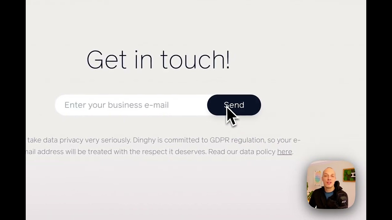
A little background: like many others, we use HubSpot for CRM and marketing newsletters. While HubSpot offers signup forms, we found that fully customizing these forms is only available on their Pro Plan, which is quite expensive. Since we weren't ready to commit to that kind of investment, we came up with a workaround to have a beautifully integrated signup form on our website using the HubSpot API.
I'm going to show you how we did this. We created a contact on HubSpot manually using a simple form on our website. For security reasons, and to keep our HubSpot authentication token confidential, we set up an API route on our server. This means the request goes from our website to our backend, then to HubSpot, without exposing the authentication token in the browser.
This might sound complicated, but with SvelteKit, it's surprisingly easy. We have an API endpoint that simply extracts the email from the request and sends it to HubSpot's API, along with a custom property indicating the contact came from our website form. We await the response, and if all goes well, the contact is added to HubSpot instantly.
In addition to this functional aspect, we've also focused on UI details. For instance, we've implemented a beautiful animation when the form is submitted.
Now, let’s talk about a UI element we’re particularly proud of. We've created a mini contact box on our projects page. It's a small, elegantly designed section that invites users to get in touch with us. This box uses structured content from Sanity, allowing us to easily change the headline or the people featured in it. Plus, we've added a neat hover animation using the new CSS `:has` selector. This allows us to apply styles to all sibling elements, a task that was quite challenging before this selector was introduced.
I'm really pleased with how these features have turned out, blending functionality with engaging design. As always, I'd love to hear your thoughts on these developments. Let me know if you're enjoying these videos, and I'll see you in the next one!