- Video
- CSS
- Design & Feedback
- Web Development
New Dinghy Website part 7 – Fancy Links in Headlines

Video Summary
Hey everyone, Nils here from Dinghy Studio. Welcome back to our series on rebuilding our agency's website. In today’s episode, I’m excited to share a bit of a UI animation challenge we faced and how we managed it with SvelteKit and Sanity.
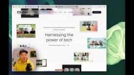
Our designers presented us with a design that required a unique animation effect. We've had a similar feature on our current website, but with the move from Next.js to SvelteKit and a slight design evolution, we needed to rebuild this from scratch.
The challenge was two-fold: creating a visually appealing animation and ensuring it could be managed easily in Sanity, our CMS. We started by addressing how to manage this content in Sanity. The design called for a regular headline with three links, each accompanied by an image. To achieve this, we created a 'fancy link component' in Sanity, which surprisingly wasn't too complicated.
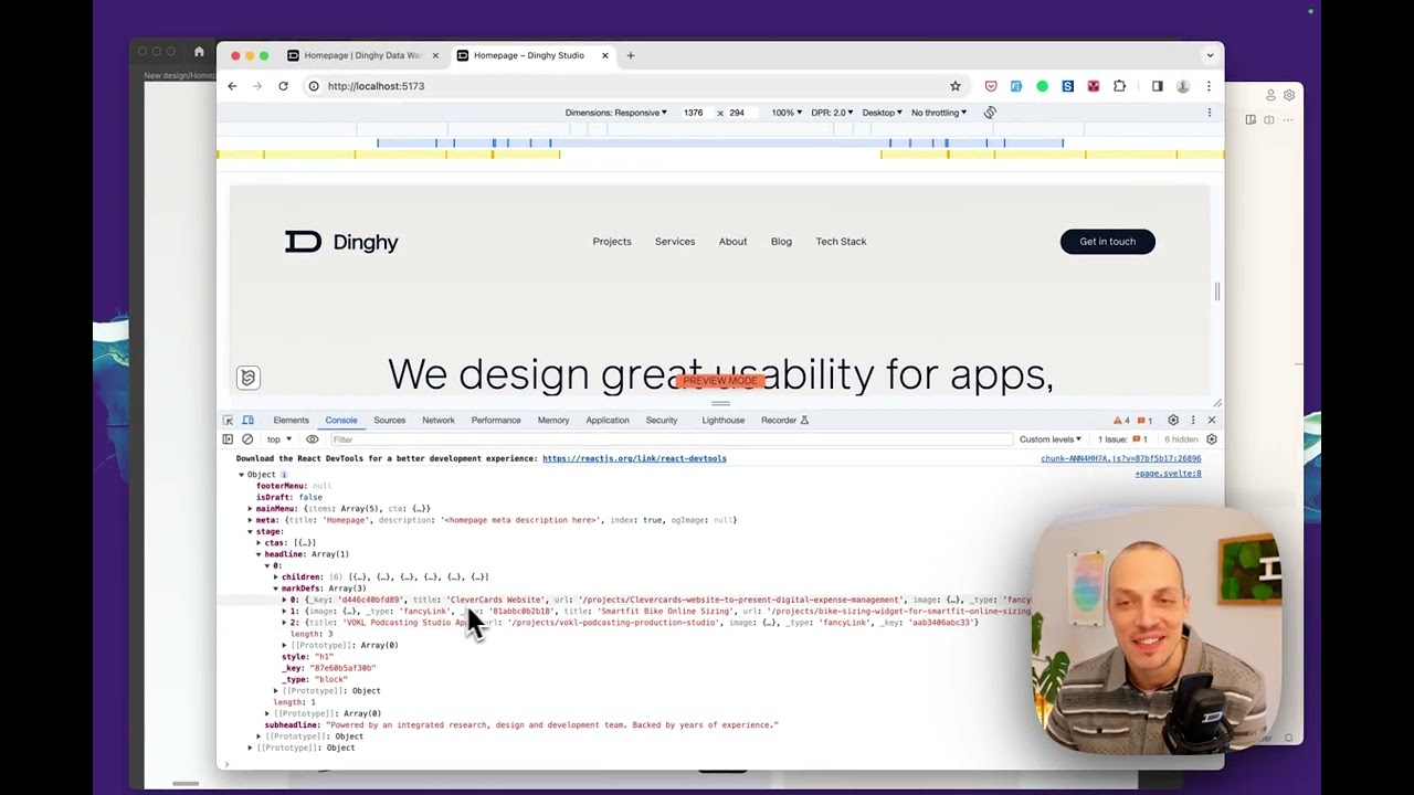
In our Sanity schema, we added a new object called 'stage' with three fields: headline, subheadline, and button. The headline was defined as an array to allow for rich text editing. We used Sanity’s block content (portable text) feature, which is structured content. I added a new annotation for our fancy link, requiring fields for an image, a URL, and an image title for accessibility.
In the Sanity studio, this translates into a simple editing experience. Content authors can upload an image, add a URL, and a title right within the text editor. It's as seamless as adding a regular link.
Now, onto the frontend implementation in SvelteKit. We used a portable text component to handle the structured text from Sanity. I created a 'Fancy Hover Headline' component to manage the animation. This component takes care of extracting data from the headline and rendering it appropriately.
On the frontend, the headline looks fantastic. When you hover over a link, a gradient underline appears, and the associated image follows the mouse cursor. This even works on mobile, where a tap first reveals the image, and a second tap follows the link.
The magic here is in the mouse movement tracking and CSS calculations to ensure a smooth animation. The best part is that all this intricate frontend work doesn’t affect our content team. They can change text or swap images in Sanity, and the frontend updates automatically, handling edge cases like image positioning relative to the cursor and browser edges.
I love how Sanity allows us to separate presentation from content authoring. It’s a powerful way to maintain a dynamic and visually engaging website without complicating the content management process.
I hope you enjoyed this glimpse into our UI animation work and the power of structured content. If you’re interested in more detailed code explanations, let me know – I’m happy to create a video focusing on the CSS and frontend logic. As always, your feedback is welcome, and I look forward to sharing more in our next video. See you then!